
Project Scope & Background
Three Research Pillars
The goal: identify where emotional friction occurs in an otherwise functional journey
Key Insights from App Reviews
Across negative reviews, a dominant pattern emerged:
Users consistently report a lack of control and transparency over both pricing and journey correctness, leading to a fundamental trust breakdown in the product.
Being overcharged
“Ticket war fast doppelt so teuer wie am Automat oder bei sbb App.”
Non-transparent pricing
“Easy to use, but horribly non-transparent pricing system. The pricing structure totally depends on the region you’re traveling in and is not always limited to the cheapest day ticket.”
Location Tracking Issues
“Don’t trust this app, it’s a scam! For 3 Times, they changed my locations of gps for some other places that i never went…”
Insights along the Journey

A mother goes on a short trip with her child in Munich. She is unaware of the ticket prices. In the bus stop, she starts the journey, checks the active ticket and notices the app has registered the wrong passenger type. She cannot edit it. She panics and stops the trip OR continues and gets overcharged.
The problem: No visibility into passenger state on the home screen, only after starting the trip and opening the active ticket. No reassurance the fare is right.
The consequence: Loss of trust in the moment, and a lasting impression that the system can’t be relied upon.
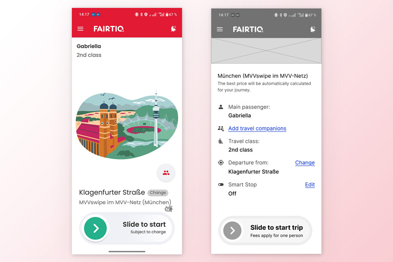
My Solution vs. Status Quo

A design proposal that puts users back in control before the trip:
- Transparent passenger status
- Add, review, and edit passengers directly from the Home screen
- Pre-trip confirmation inside the swipe toggle
Sanity Check: Validating Assumptions
This case study is based on assumptions derived from reviews, and would need to be validated across these dimensions before shipping:
- Business Before: Is this segment meaningful in terms of users, revenue, or retention? After: Were complaints, refund requests, and churn reduced?
- User Before: Is passenger status a real pain point, or an edge case? After: Does the prototype pass usability testing, or do we need to iterate?
- Tech Before: Is this solution feasible? Does it add unnecessary complexity? After: Did the implementation affect speed, accuracy, or system stability?
- UX Why does passenger setup require detailed inputs (e.g. birth date) instead of simpler ticket categories?
Delight Layer: Delight Comes After Trust
Once the trust layer is solid, there’s an opportunity to reinforce the right choice — making sustainable travel feel rewarding.
Additional Recommendations

Optimize contrast for real-world visibility. For the onboarding flow, prefer a neutral background with strong text contrast, and use brand colors only as accents. Design for real conditions (outdoor glare, small screens, motion, low attention) keeping users with visual impairments, senior travelers, and people in transit stress in mind.
Use illustrations for empty states. Transform moments of uncertainty into moments of clarity and delight.
Show loading feedback in context. Use loading indicators or skeleton states exactly where content is being fetched.
Takeaway
The strongest “delight” move wasn’t a feature — it was sequencing. Users don’t reward charm if they don’t trust the basics first. Solving for transparency and control before designing anything playful turned out to be the more strategic (and more honest) path to a lovable product.
Tags:
UX Research, Prototyping, Empathy Map
Product:
Mobility App
Team:
Individual case study
Date:
June 30, 2026
A short design challenge for a mobile app: I dug into FairTIQ’s negative reviews and existing app, and improved the travel flow with companions by giving users visibility and control over passenger details.